7. CSS Flexbox
Propojení stránek mezi sebou
- pomocí url
-
každá stránka má svůj
.html
soubor -
index.html
,index2.html
,index3.html
, ... - je lepší používat css v souboru, kvůli opakovanému použití
Path operators
./
- aktuální složka../
- nadřazená složka
Dev Tools
- nástroje, které umožňují zobrazit kód stránky ve webovém prohlížeči
- umožňují zobrazit chyby v kódu
- umožňují zobrazit výkon stránky
Odsazení
Většina prohlížečů automaticky odsazuje prvky.
Vnější
- vlastnost
margin
-
margin-top
,margin-right
,margin-bottom
,margin-left
<!DOCTYPE html>
<html>
<head>
	<style>
		p {
			margin: 30px;
		}
	</style>
</head>
<body>
	<p>Ahoj Honzo</p>
</body>
</html>
Vnitřní
- vlastnost
padding
-
padding-top
,padding-right
,padding-bottom
,padding-left
<!DOCTYPE html>
<html>
<head>
	<style>
		div{
			width: 200px;
      height: 200px;
      background-color: antiquewhite;
			padding: 30px;
		}
	</style>
</head>
<body>
	<div>
		<p>Ahoj Honzo</p>
	</div>
</body>
</html>
Border
- vlastnost
border
-
border-top
,border-right
,border-bottom
,border-left
<!DOCTYPE html>
<html>
<head>
<style>
div{
width: 100px;
height: 100px;
background-color: antiquewhite;
padding: 30px;
border: 20px solid green;
}
</style>
</head>
<body>
<div>
<p>Ahoj Honzo</p>
</div>
</body>
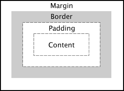
</html>Box model
- každý element je obdélník
-
skládá se z
padding
,border
,margin
border radius
-
border-radius
- vlastnost pro zaoblení rohů - hodnoty v
pixelech
<!DOCTYPE html>
<html>
<head>
	<style>
		div{
			width: 100px;
	  	height: 100px;
	  	background-color: antiquewhite;
			border-radius: 5px;
		}
	</style>
</head>
<body>
	<div>
		<p>Ahoj Honzo</p>
	</div>
</body>
</html>
Délka a šířka
-
vlastnosti
width
aheight
<!DOCTYPE html>
<html>
<head>
	<style>
		div {
			width: 100px;
			height: 100px;
			background-color: red;
		}
	</style>
</head>
<body>
	<div>
	</div>
</body>
</html>
Zarovnání prvků zleva i zprava doprostřed
-
margin-left: auto;
margin-right: auto;
<!DOCTYPE html>
<html>
<head>
	<style>
		div {
			width: 100px;
			height: 100px;
			background-color: red;
			margin-left: auto;
			margin-right: auto;
		}
	</style>
</head>
<body>
	<div>
	</div>
</body>
</html>
Typy kombinátorů
- potomci -
div p
- přímí potomci -
div > p
- sourozenci -
div + p
- všechny sourozence -
div ~ p
- více selektorů -
div, p
Pseudotřídy
:hover
- při najetí myší:active
- při kliknutí:focus
- při zaměření
Display
-
display
- vlastnost pro změnu zobrazení elementu -
hodnoty
block
,inline
,inline-block
,flex
,grid
Blokové zobrazení
-
block
- element zabírá celou šířku stránky a začíná na novém řádku -
div
,h1
,p
<!DOCTYPE html>
<html>
<head>
	<style>
		div {
			/*display: block;*/
			height: 100px;
			background-color: cadetblue;
		}
	</style>
</head>
<body>
	<div></div>
</body>
</html>
Inline zobrazení
-
inline
- element zabírá jen tolik místa, kolik potřebuje a nezačíná vždy na novém řádku span
,a
<!DOCTYPE html>
<html>
<head>
	<style>
	span {
		/*display: inline;*/
		color: cadetblue;
	}
	</style>
</head>
<body>
	<span>Toto je první span</span>
	<span>Toto je druhý span</span>
</body>
</html>
Inline-block zobrazení
-
inline-block
- kombinuje výhody inline a block - prvky jsou vedle sebe, ale můžeme nastavit width a height
<!DOCTYPE html>
<html>
<head>
	<style>
		.box {
			display: inline-block;
			width: 80px;
			height: 80px;
			background-color: lightcoral;
			margin: 5px;
		}
	</style>
</head>
<body>
	<div class="box">1</div>
	<div class="box">2</div>
	<div class="box">3</div>
</body>
</html>
1
2
3
Flexbox
-
display: flex
- vlastnost pro vytvoření flexboxu - flexbox je způsob, jak rozložit prvky do kontejneru
- moderní způsob vytváření layoutů
Flexbox - základní ukázka
<!DOCTYPE html>
<html>
<head>
	<style>
		.container {
			display: flex;
			background-color: lightgray;
			padding: 10px;
		}
		.item {
			background-color: coral;
			padding: 20px;
			margin: 5px;
		}
	</style>
</head>
<body>
	<div class="container">
		<div class="item">1</div>
		<div class="item">2</div>
		<div class="item">3</div>
	</div>
</body>
</html>
1
2
3
Flexbox - vlastnosti
-
justify-content
- zarovnání prvků na hlavní ose -
align-items
- zarovnání prvků na vedlejší ose -
flex-direction
- směr, ve kterém se prvky budou řadit flex-wrap
- zalamování prvků
justify-content
-
hodnoty:
flex-start
,center
,flex-end
,space-between
,space-around
<!DOCTYPE html>
<html>
<head>
	<style>
		.container {
			display: flex;
			justify-content: center;
			background-color: lightgray;
			padding: 10px;
		}
		.item {
			background-color: coral;
			padding: 20px;
			margin: 5px;
		}
	</style>
</head>
<body>
	<div class="container">
		<div class="item">1</div>
		<div class="item">2</div>
		<div class="item">3</div>
	</div>
</body>
</html>
1
2
3
align-items
-
hodnoty:
flex-start
,center
,flex-end
,stretch
<!DOCTYPE html>
<html>
<head>
	<style>
		.container {
			display: flex;
			align-items: center;
			height: 200px;
			background-color: lightgray;
			padding: 10px;
		}
		.item {
			background-color: coral;
			padding: 20px;
			margin: 5px;
		}
	</style>
</head>
<body>
	<div class="container">
		<div class="item">1</div>
		<div class="item">2</div>
		<div class="item">3</div>
	</div>
</body>
</html>
1
2
3
flex-direction
-
hodnoty:
row
,column
,row-reverse
,column-reverse
<!DOCTYPE html>
<html>
<head>
	<style>
		.container {
			display: flex;
			flex-direction: column;
			background-color: lightgray;
			padding: 10px;
		}
		.item {
			background-color: coral;
			padding: 20px;
			margin: 5px;
		}
	</style>
</head>
<body>
	<div class="container">
		<div class="item">1</div>
		<div class="item">2</div>
		<div class="item">3</div>
	</div>
</body>
</html>
1
2
3
Flexbox kombinace
<!DOCTYPE html>
<html>
<head>
	<style>
		.container {
			display: flex;
			justify-content: space-between;
			align-items: center;
			height: 150px;
			background-color: lightgray;
			padding: 10px;
		}
		.item {
			background-color: coral;
			padding: 15px;
			border-radius: 5px;
		}
	</style>
</head>
<body>
	<div class="container">
		<div class="item">Levý</div>
		<div class="item">Střed</div>
		<div class="item">Pravý</div>
	</div>
</body>
</html>
Levý
Střed
Pravý
CSS Grid
-
display: grid
- vytvoření mřížkového layoutu - mocný nástroj pro 2D layouty
- ideální pro složitější rozvržení stránky
Grid - základní ukázka
<!DOCTYPE html>
<html>
<head>
	<style>
		.grid-container {
			display: grid;
			grid-template-columns: 1fr 1fr 1fr;
			gap: 10px;
			background-color: lightgray;
			padding: 10px;
		}
		.grid-item {
			background-color: lightblue;
			padding: 20px;
			text-align: center;
		}
	</style>
</head>
<body>
	<div class="grid-container">
		<div class="grid-item">1</div>
		<div class="grid-item">2</div>
		<div class="grid-item">3</div>
		<div class="grid-item">4</div>
		<div class="grid-item">5</div>
		<div class="grid-item">6</div>
	</div>
</body>
</html>
1
2
3
4
5
6
Grid - vlastnosti
-
grid-template-columns
- definuje sloupce -
grid-template-rows
- definuje řádky gap
- mezery mezi prvky-
grid-column
,grid-row
- umístění konkrétního prvku
Grid - pokročilý příklad
<!DOCTYPE html>
<html>
<head>
	<style>
		.grid-layout {
			display: grid;
			grid-template-columns: 200px 1fr 150px;
			grid-template-rows: 60px 1fr 40px;
			gap: 10px;
			height: 300px;
		}
		.header {
			grid-column: 1 / 4;
			background-color: lightcoral;
			padding: 10px;
		}
		.sidebar { background-color: lightblue; padding: 10px; }
		.main { background-color: lightgreen; padding: 10px; }
		.aside { background-color: lightyellow; padding: 10px; }
		.footer {
			grid-column: 1 / 4;
			background-color: lightpink;
			padding: 10px;
		}
	</style>
</head>
<body>
	<div class="grid-layout">
		<div class="header">Hlavička</div>
		<div class="sidebar">Boční panel</div>
		<div class="main">Hlavní obsah</div>
		<div class="aside">Aside</div>
		<div class="footer">Patička</div>
	</div>
</body>
</html>
Hlavička
Boční
Hlavní obsah
Aside
Patička
Flexbox vs Grid
- Flexbox - jednorozměrný layout (řádek nebo sloupec)
- Grid - dvourozměrný layout (řádky i sloupce současně)
- Flexbox - ideální pro komponenty a menší části
- Grid - ideální pro celkové rozvržení stránky
Interaktivní hra pro učení CSS Grid